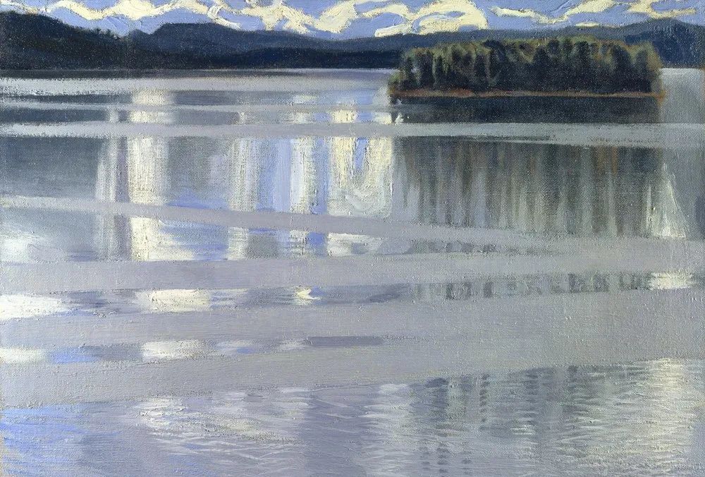
The Fall/Winter 25/26 jewelry design color focus takes a fascinating and innovative approach by extracting classic gradient colors from famous paintings and incorporating them into jewelry design.
This design approach not only taps into the potential of masterpieces but also combines tradition with contemporary fashion, benefiting brand innovation and elevation. By leveraging the influence of famous artworks, brands can create more sophisticated products and capture consumer attention in a crowded market.
The meticulous recreation of painting imagery or scenes in jewelry pieces, with attention to detail and the use of sparkling elements, authentically interprets the emotions of the original artwork.
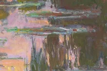
Water-Lilies
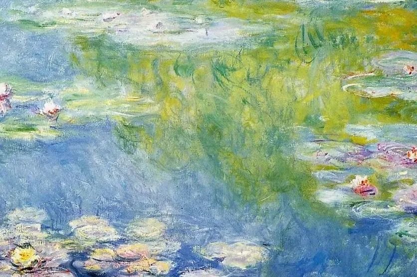
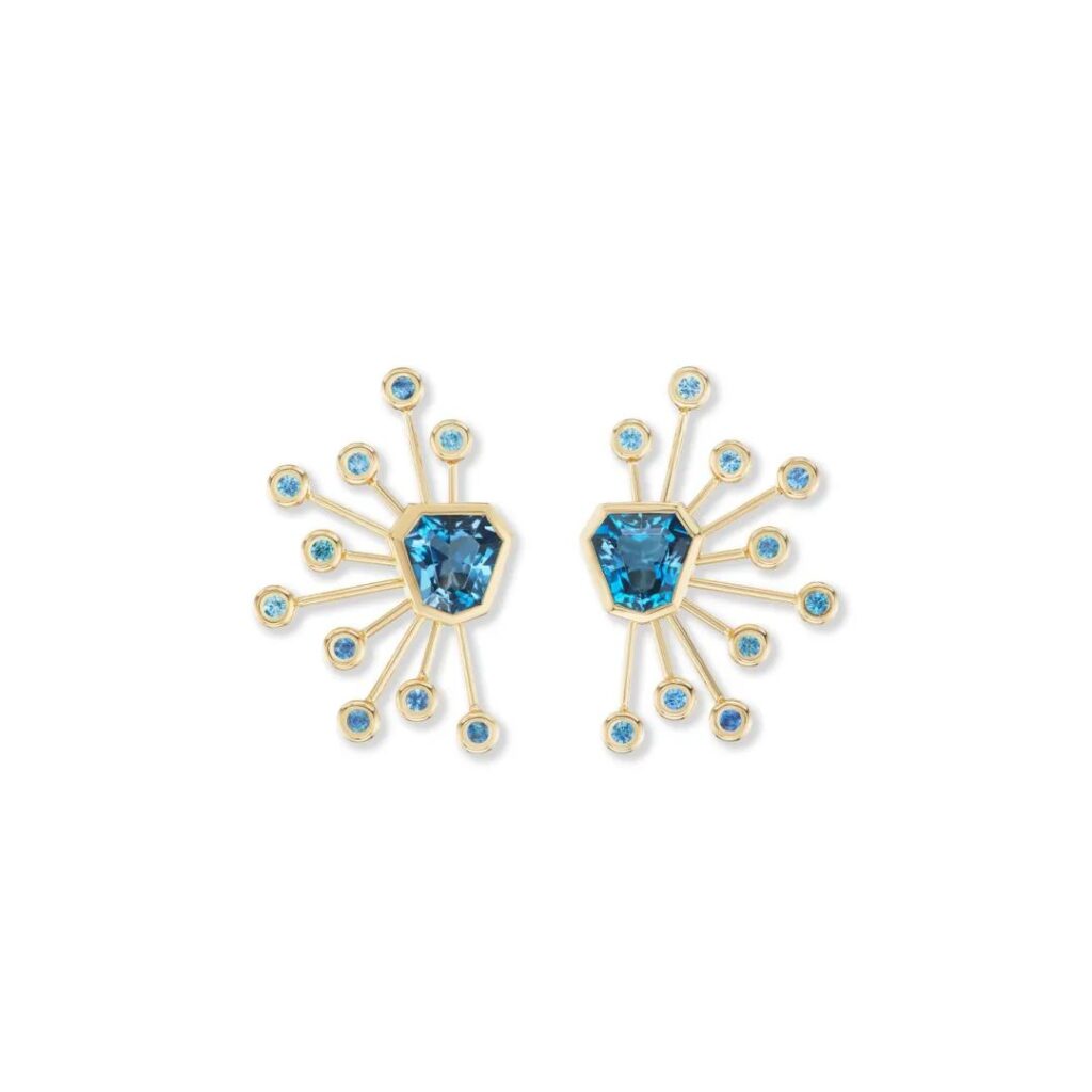
Take Claude Monet’s “Water-Lilies” series as an example. The key colors applied are celestite blue, moss green, and strawberry pink. These hues reflect the artist’s sensitive capture of light and shadow variations, presenting ever-changing colors and textures that create a soft and enchanting atmosphere.


Monet’s “Water Lilies” is a series of abstract waterscapes depicting a pond of water lilies. The paintings feature delicate lily pads floating on the water’s surface, interspersed with vibrant, colorful water lily flowers. The reflections of the sky and trees in the water create an interplay of reality and illusion, giving a dreamlike quality to the scene. The entire composition exudes natural tranquility and serenity.
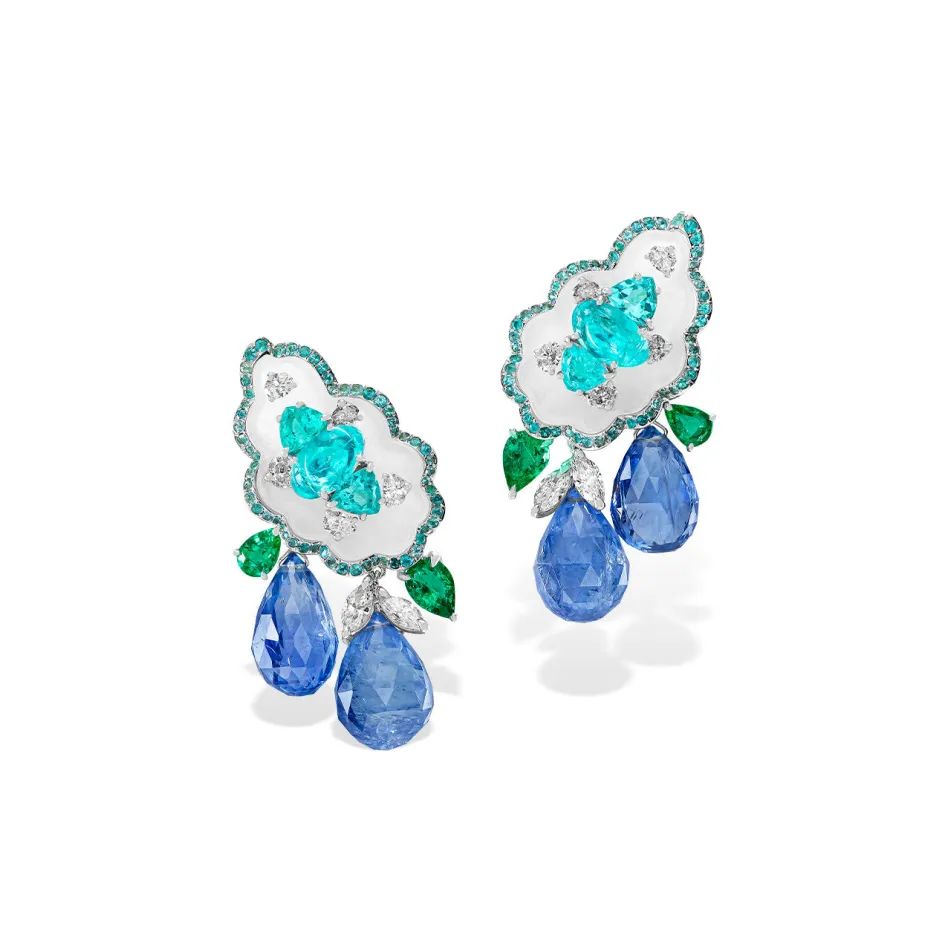
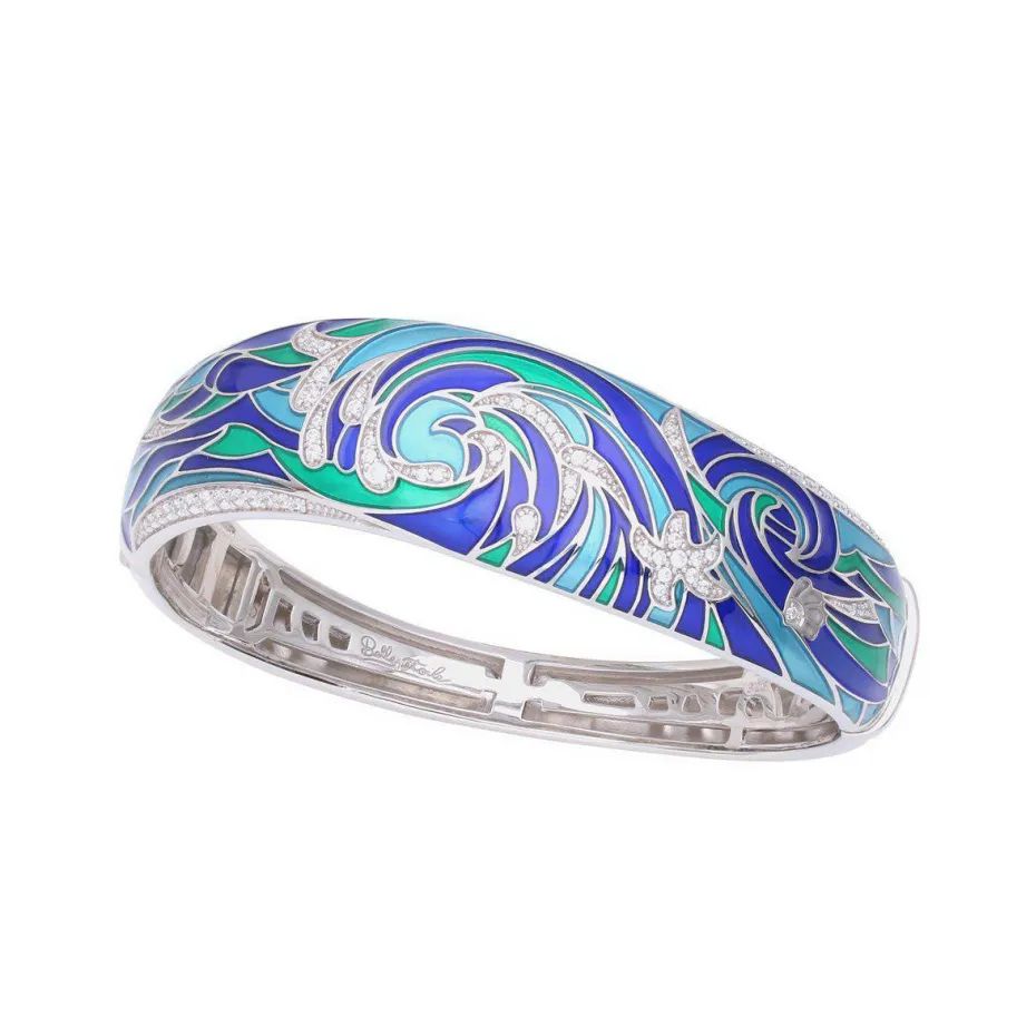
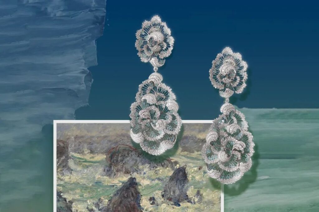
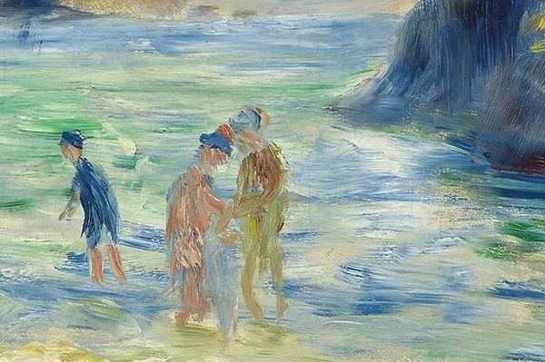
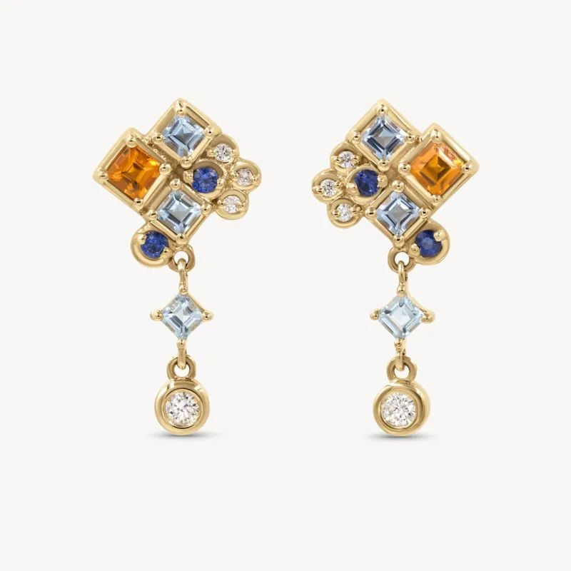
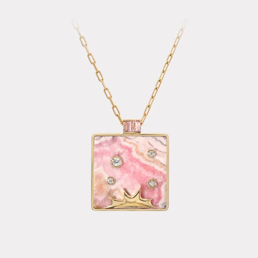
Moulin Huet Bay
The key colors extracted from this painting are applied to the selection of gemstones or enamel work, reinterpreting the painter’s presentation of color aesthetics. The dynamic feeling of water ripples is showcased through detailed design.


French Impressionist painter Pierre-Auguste Renoir’s “Moulin Huet Bay” (c. 1883) is reimagined in Boodles’ new collection. The colorful reflections in the water are recreated using diamonds, colored sapphires, and tsavorites. Key colors applied: Vienna blue, champagne beige, and pale green.
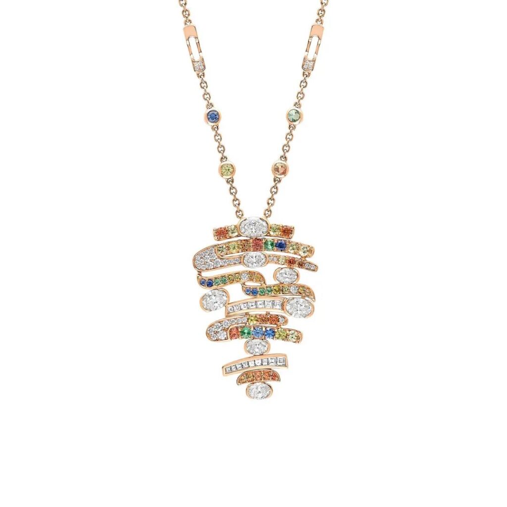
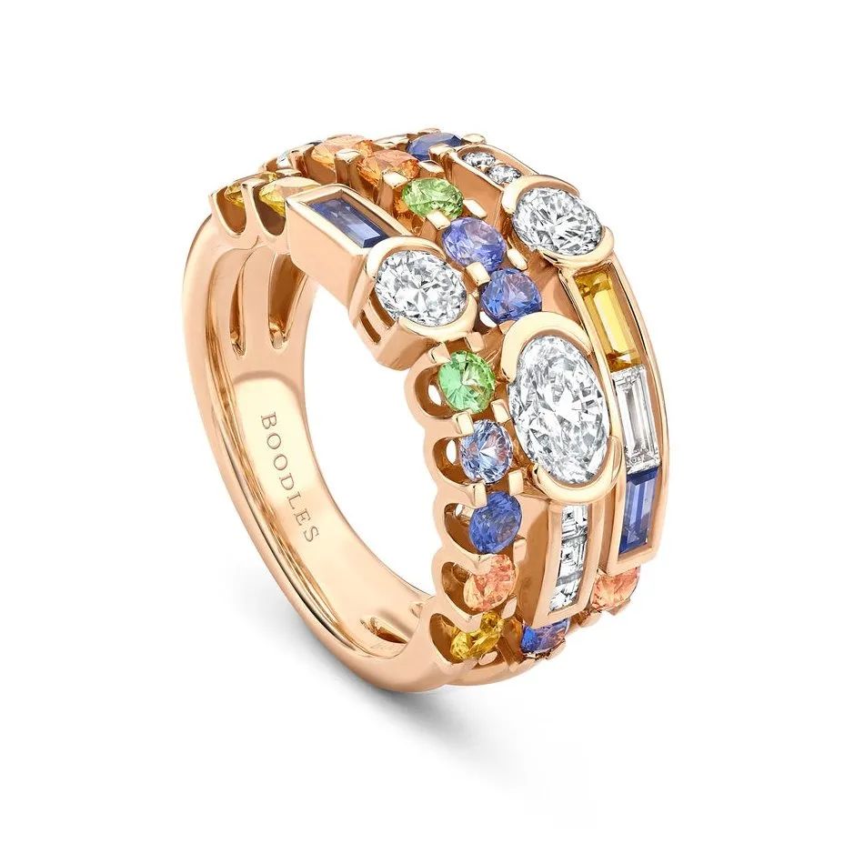
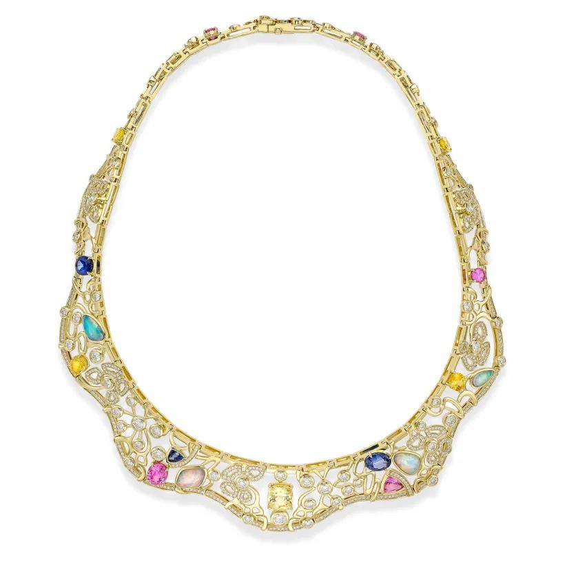
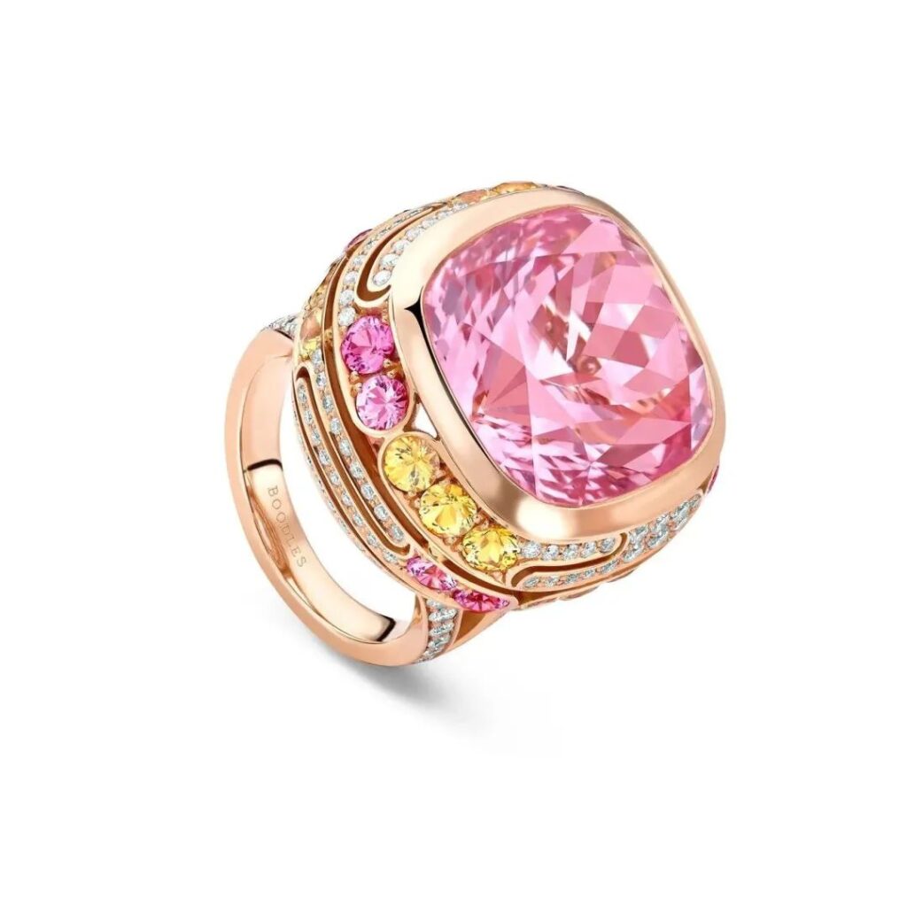
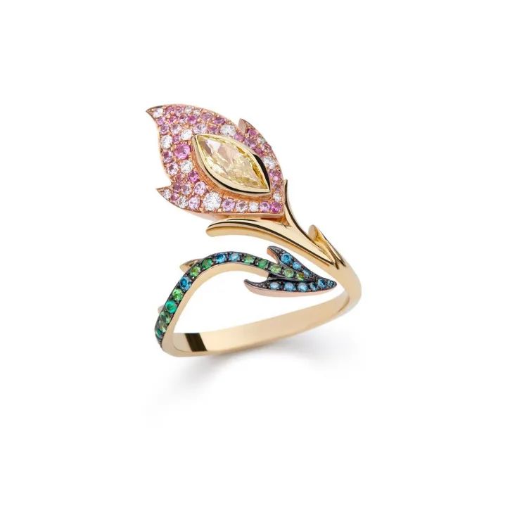
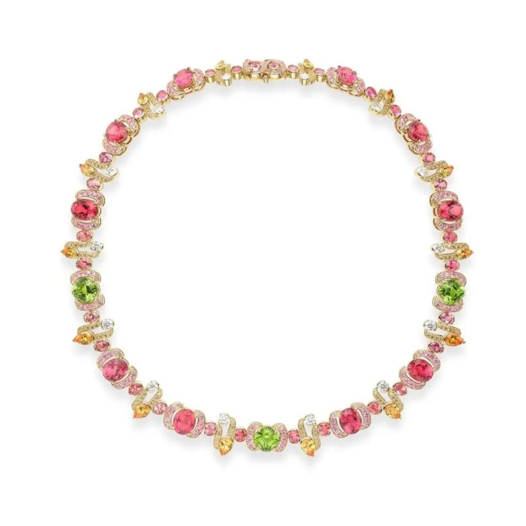
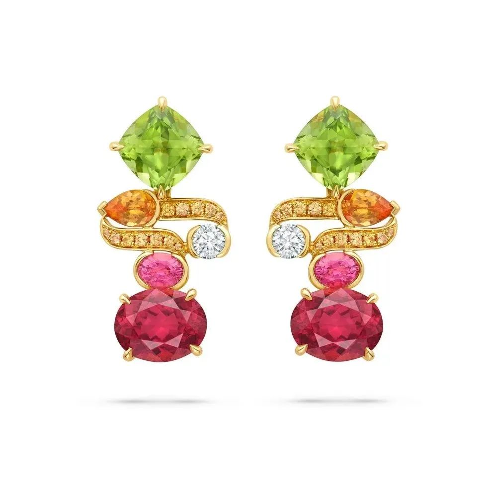
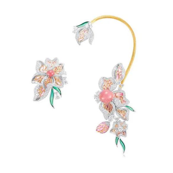
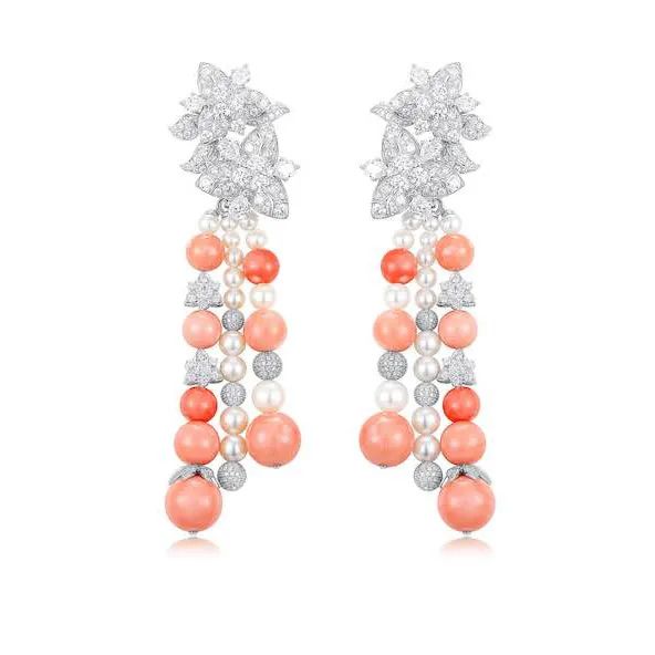
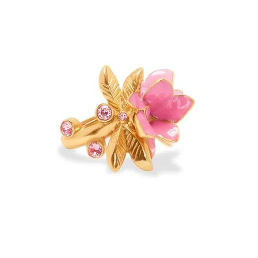
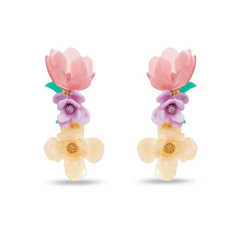
Water-Lilies, Setting Sun
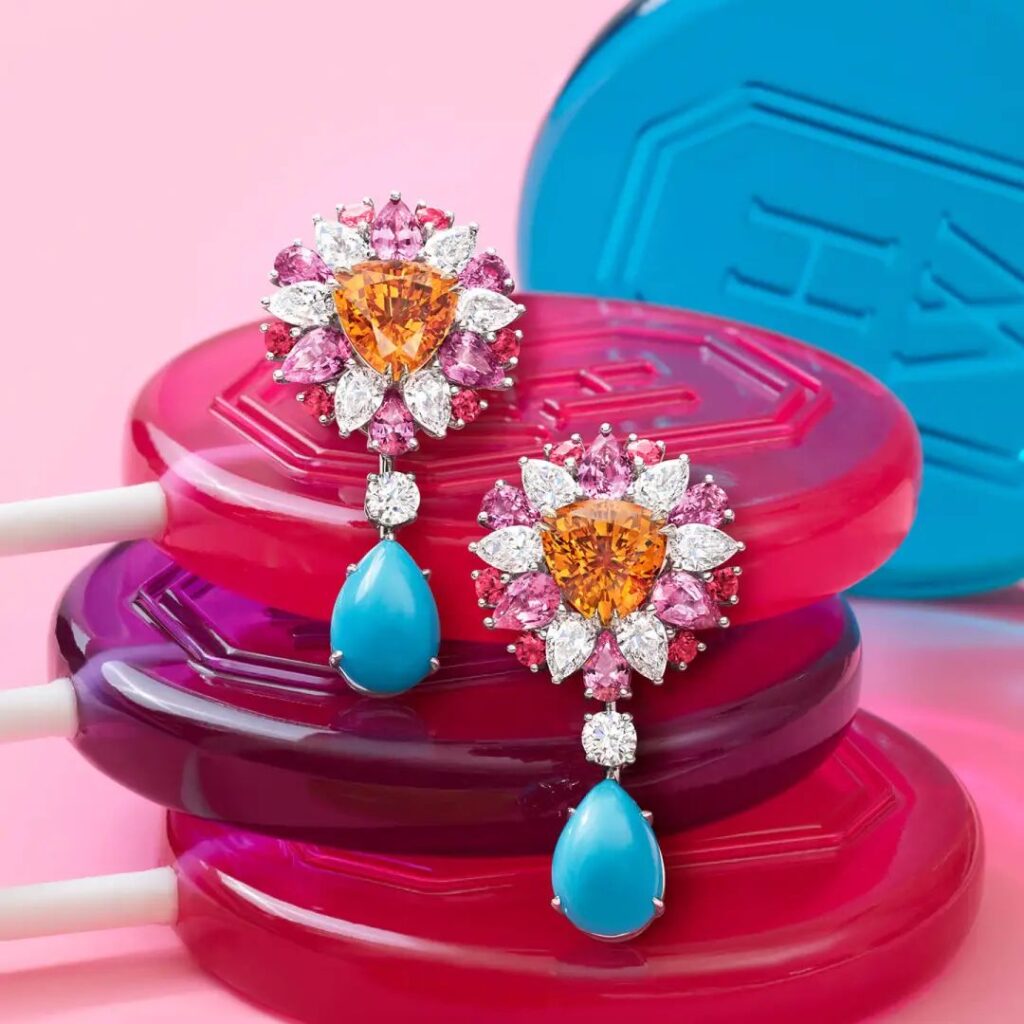
Key colors: Almond nougat pink, beach lilac, and young mustard. The jewelry pieces feature pink tourmaline, spinel, orange garnet, peridot, pink and orange sapphires, and diamonds. The ring’s center stone is a 24.02ct morganite, surrounded by diamonds and colored sapphires.

Monet’s famous “Water-Lilies, Setting Sun” depicts a shimmering water surface extending into the distance on a vertical plane. The seemingly casual, colorful brushstrokes are soft and beautiful, making the water appear to flow and capturing the ephemeral play of light and shadow on the water’s surface.
Impression, Sunrise
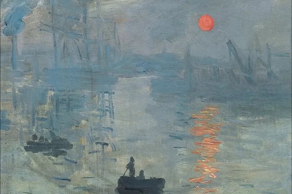
Key colors: Orange sunshine, tawny, and galena blue. Materials used include conch pearls, enamel, and diamonds. The design focuses on multi-color shading and gradient water ripple effects in the materials.


Monet’s famous “Impression, Sunrise” presents colors and forms in a blurry, hazy impression, emphasizing the importance of sensation and intuition rather than precise reproduction of details.
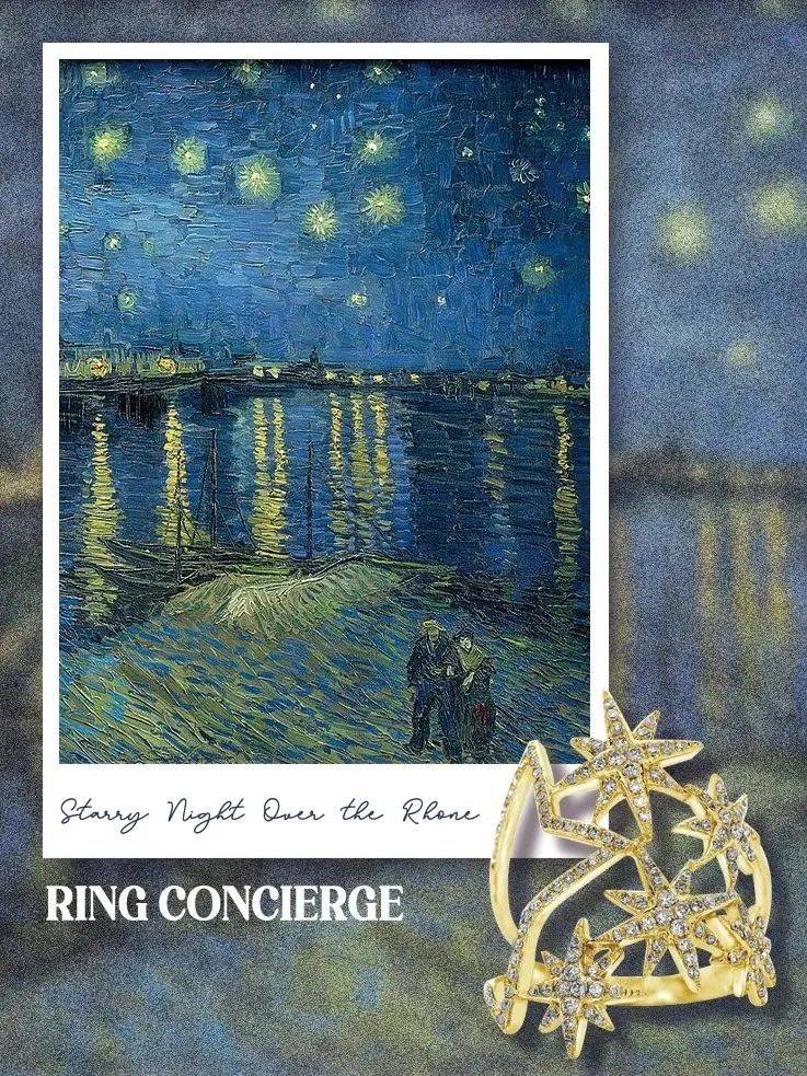
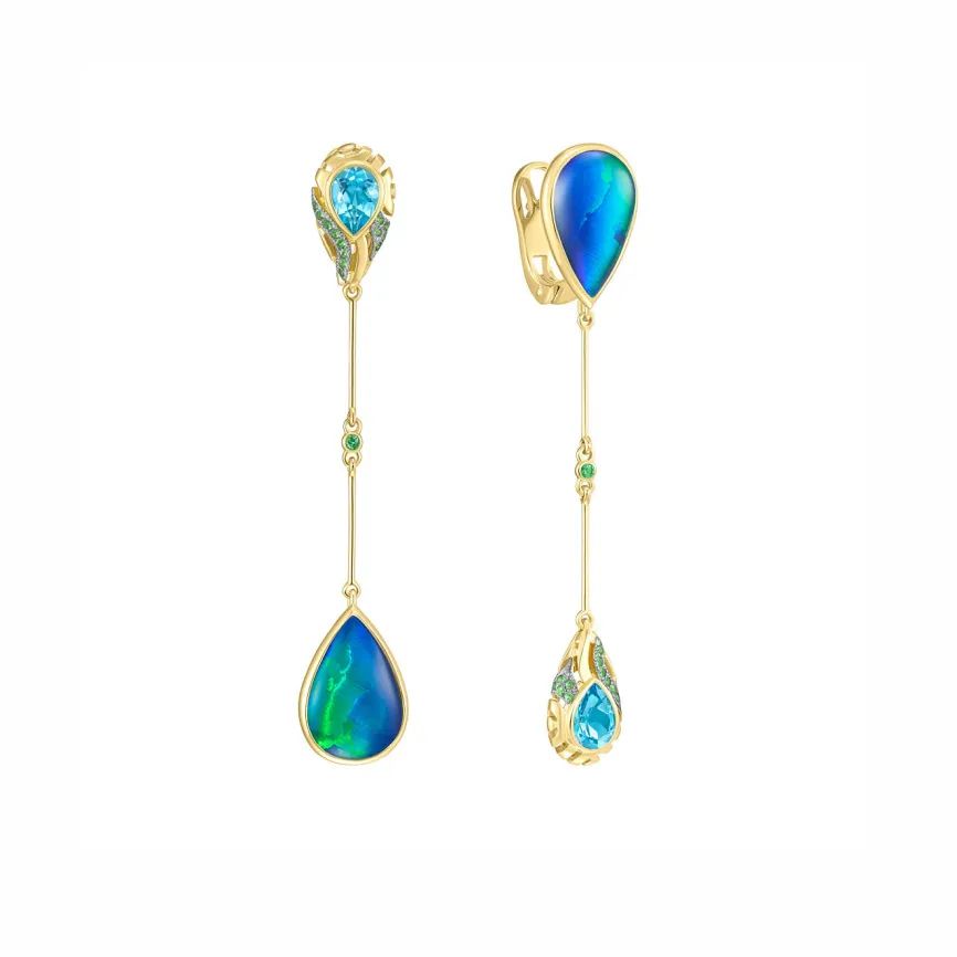
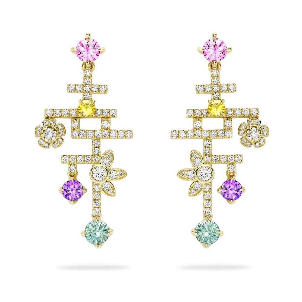
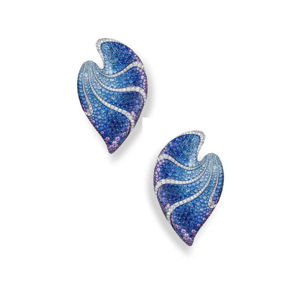
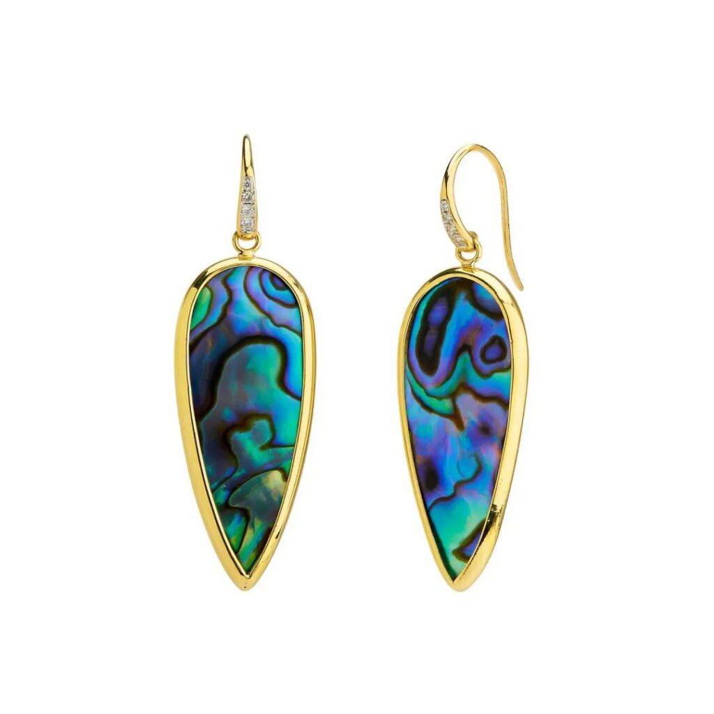
Starry Night
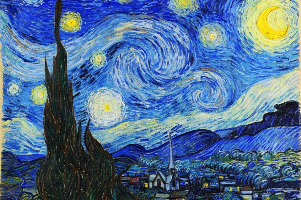
In jewelry applications, materials such as abalone shell, opal, and gradient-set sapphires are used. The design emphasizes color gradient effects, showcasing a brilliant and dazzling starry sky.


“Starry Night” is an oil painting created by Dutch Post-Impressionist painter Vincent van Gogh in 1889 while at the Saint-Paul-de-Mausole asylum in Saint-Rémy-de-Provence, France. It is one of his most famous works. In this piece, van Gogh uses deep blue, dark purple, and black as the main tones to depict a magnificent and spectacular starry sky scene.
Masterpieces Meet Metals: The Fusion of Fine Art and Jewelry in Fall/Winter 25/26 Color Trends
Tweet